Simplicity is Hard: Why Real Design Takes Forever

Part 1: The Invisible Complexity
Most people think design is what something looks like. That’s not design. That’s cosmetics.
Design is what it does, how it behaves, what it feels like to use. Steve Jobs said it clearly, “Design is not just what it looks like and feels like. Design is how it works.” And that one idea exposes an entire industry addicted to pretty shells. Because once you accept that design is how it works, you’re enforced to confront an uncomfortable truth…when something looks simple, it usually wasn’t.
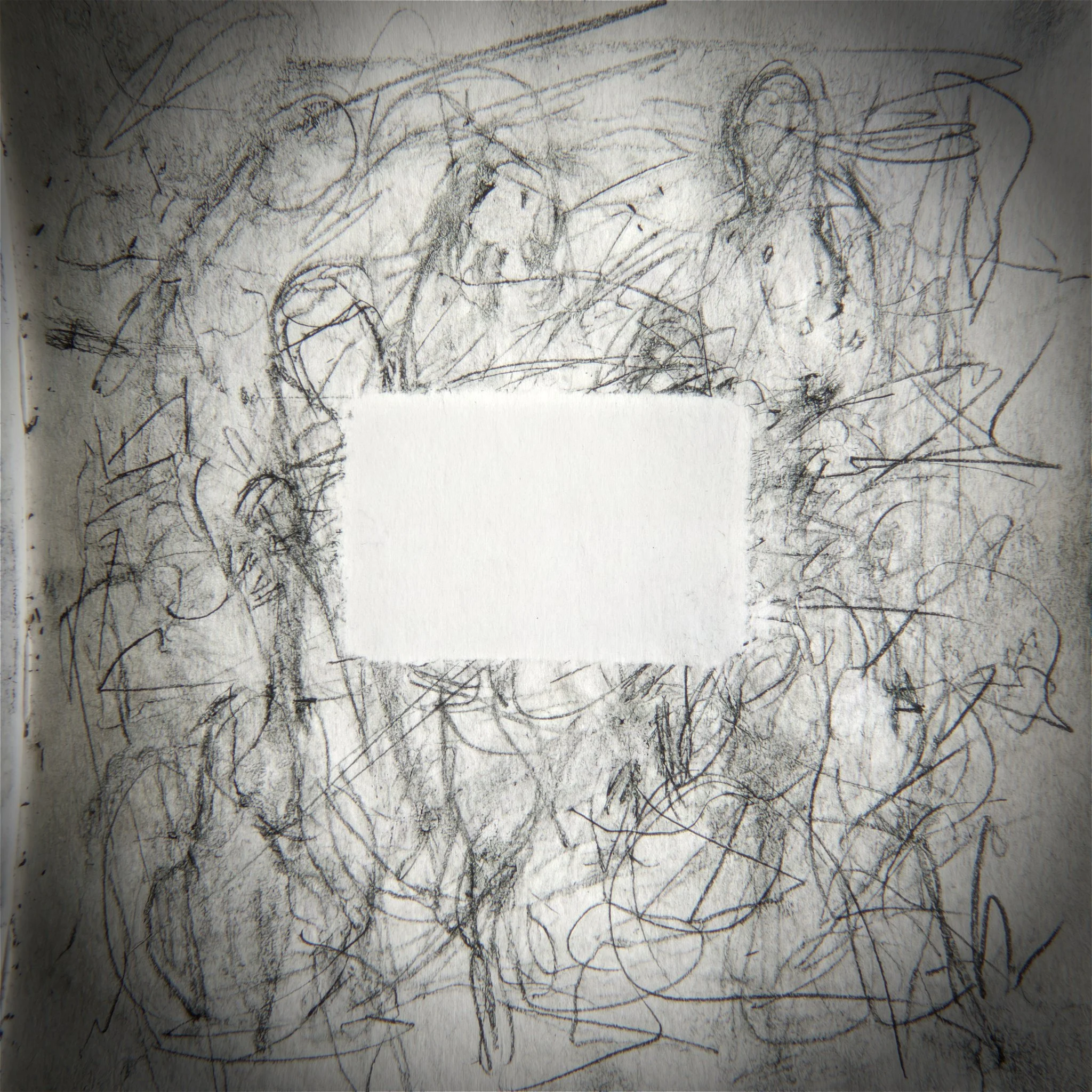
Simplicity is rarely the first idea. The first idea is obvious. The first idea is LOUD. The first idea is “Hey! Add another feature.” The first idea is “make it POP!” The first idea is what happens when you don’t understand the problem deeply enough to remove anything. Real simplicity shows up much later, after you’ve been in the trenches of complexity, mapped the landmines and adjusted all the difficult designs into the right place. That’s why the “cleanest” products/services feel supernatural to us. Not because they’re empty or hollow but because they’ve been solved.
The simplest outcomes tend to have the longest journeys. Simplicity isn’t the absence of complexity. It’s complexity you’ve iterated through so the user never has to experience it.
Jony Ive, framed simplicity as something you earn by going through the complexity and not pretending it isn’t there. Quote, “To be truly simple, you have to go really deep.”
Shallow minimalism hides complexity like a lie.
Deep Simplicity destroys complexity at its root.
Deep Simplicity is not removing visible clutter, it’s eliminating the need for it.
This is why the parts nobody sees matter. Jobs said, “When you're a carpenter making a beautiful chest of drawers, you're not going to use a piece of plywood on the back, even though it faces the wall and nobody will ever see it. You'll know it's there, so you're going to use a beautiful piece of wood on the back.” As a rule, if you cut corners where nobody looks, you train yourself to cut corners everywhere. And this isn’t about waste. It’s about integrity. True quality cannot be faked, and cutting corners in “invisible” places will always corrupt the whole thing.
Simplicity is not a “look”. It’s a standard. Nothing accidental. Jobs said,"Most people make the mistake of thinking design is what it looks like...People think it's this veneer, that the designers are handed this box and told, 'Make it look good!’” Dieter Rams built an entire life around that discipline. “Good design is as little design as possible.” “Less, but better”.
None of this means “less effort”. It means less noise, less manipulation, less trend-chasing, less visual clutter. This only works when the result is chiseled thoroughly down to the last detail because with less clutter, everything left behind gets louder.
That’s the paradox, the simpler the final piece, the more intense the invisible work was. With fewer elements, each element becomes LOUD. Every flaw becomes obvious. Every proportion and millimeter matters. Complexity can hide many mistakes, simplicity exposes them all. That’s why real simplicity takes forever. It forces you to be accountable, it forces you to make decisions you can truly defend, it forces you to build something that can survive all scrutiny… not just attention.
Simplicity is subtraction, but subtraction only comes after multiplication…more understanding, more iterations, more collisions with design. Which brings us to the part nobody wants to do…
Part 2: The Process Nobody Wants To Do
We all fall into the same trap. It starts off innocently. You start building something and you hit a problem. So you add a fix. That fix creates a new piece of friction to the design and therefore you add another fix. You add, and you add, and you add.
As you’ve guessed, this only compounds. You believe you are solving the issues of your product but you are just burying everything under layers of “solutions.” The reason real design takes “forever” is not because we are slow. It is because we cannot simplify what we do not understand.
In simpler words, If you don’t know the system, you add to it. If you do know the system, you subtract from it.
The Instinct to Preserve
The hardest part is reversing this mentality. It is in us humans, to detest our own death. We pour our souls say into a project and all of a sudden need to cut it? Delete the work we’ve spent days on? That feeling feels no less than death deep down. We fear it. We want to keep everything, why? Because WE made it. That fear is what stops us.
A child doesn’t walk by being completely fearful, they walk because they are pure and willing to fall. In design, we have to have that same willingness. You have to look at your work and be willing to let the parts that don’t work, die.
Every element must earn its right to exist. If it doesn’t scream like it’s fighting for its life, it has to go.
The Measurement of Purity
“Good enough” is a state of fatigue. It’s what happens when you are tired of the work and you settle. But fatigue is black ink. It clouds the judgement.
Purity is different.
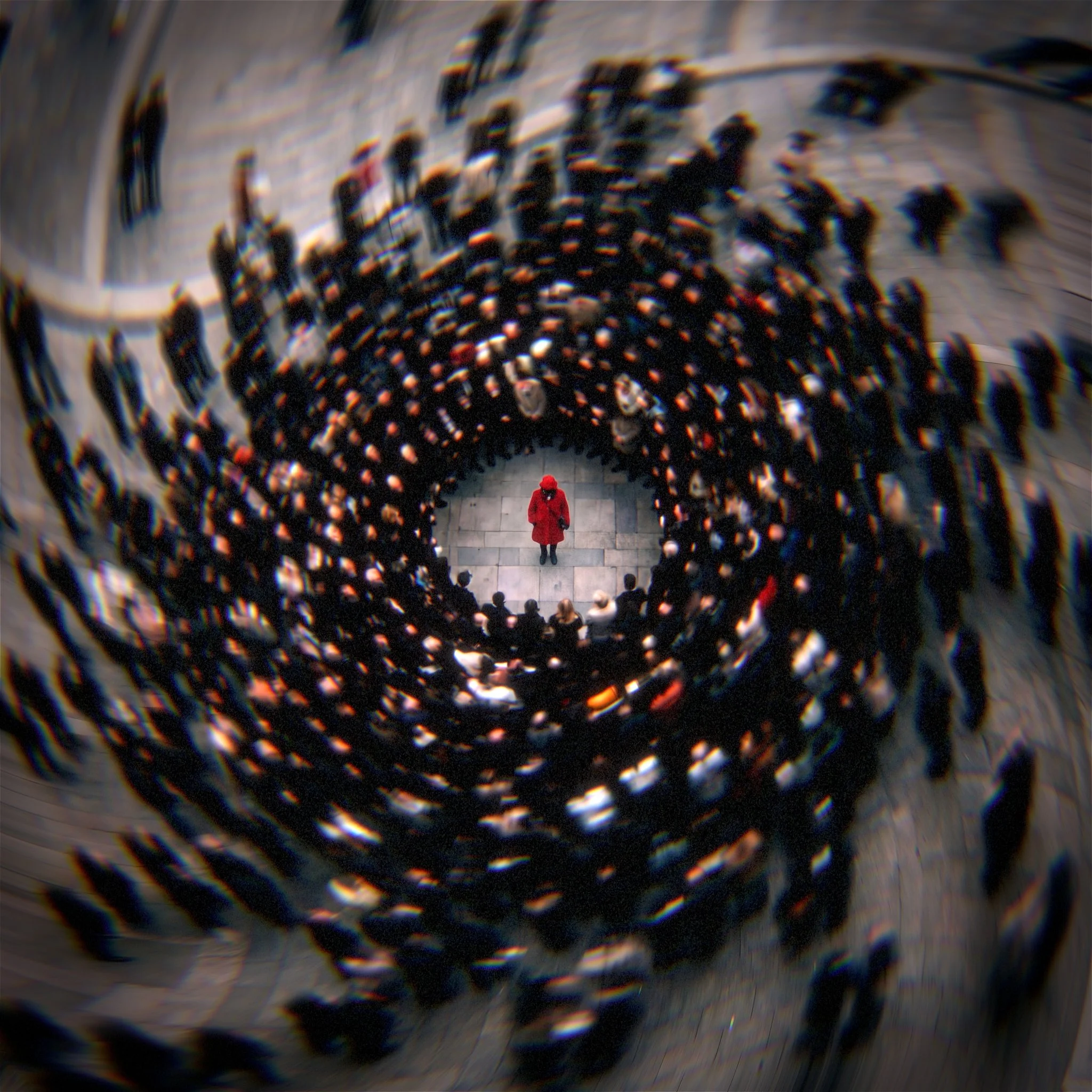
To see if something is pure, you have to remove the noise. You have to stop comparing yourself to everyone else. Imagine it’s just you and your design in a vacuum of black. No trends. No audience. No ego. Nothing besides you and your work.
In that vacuum, the work is naked. It’s binary. You look at it and in that split second you’ll know. It’s either right or it’s wrong.
This is the beauty of the “Why”. When you strip everything else away, you aren’t guessing whether it’s good. You know exactly why all those ideas of the design are there. You didn’t “decide” whether the design is pure. You recognized it. And if you aren’t there yet…
Part 3: The Fake Simple
Fake simple is what happens when people chase the look of simplicity instead of doing the work.
They strip the surface. They remove labels. They dampen everything. They remove anything that would expose indecision. They call it “clean.” They call it “minimal.” But what they really made is empty, and emptiness is not simplicity. Emptiness is just a lack of true understanding.
Here’s the difference:
Empty is when you removed things because you didn’t know what they were doing.
Simple is when you removed things because you knew exactly what they were doing and you proved they weren’t needed.
Simple doesn’t feel bare. Simple feels solved. It feels like nothing is missing. Fake simple always has that subtle tension, it looks refined, but it makes you work. You hesitate. You hunt. You second-guess. The interface is “clean,” but you yell out in rage as you cannot find the way to progress.
That’s the failure, when simplicity becomes a style, it stops being a solution.
Stylistic simplicity is obsessed with the screenshot. The vibe. The white space. The typography. The trendy palette. The micro-animations that say “we’re modern!” But it’s not rooted in a ruthless “why.” It’s rooted in taste as decoration, taste as camouflage.
And this is where the template problem shows up.
A template can look expensive. It can look “designed.” Templates borrow structure without earning any meaning. They give you the illusion of clarity while skipping the deep work that creates real meaning.
You can spot it instantly, the design looks refined, but it’s fragile. Change one requirement and it breaks. Add real constraints and it collapses. Put it in the hands of real people and suddenly you need tooltips, onboarding, disclaimers, walkthroughs, because the “simplicity” was never considered. It was only on the surface.
Real simplicity makes you feel guided without noticing the guide. Fake simplicity makes you feel like you’re the problem.
That’s why I don’t respect “minimal” by default. Minimal is cheap. Real simplicity is expensive. One is a costume. The other is a solution.
And the moment one unconsidered element slips through the cracks, one overlooked detail by the director, the entire fake-simple illusion breaks.
Part 4: The Cost of One Miss
Simplicity has a weakness, it can’t hide your mistakes. The cleaner the design, the louder the smallest flaws become. One overlooked detail doesn’t hide, it becomes the whole story. That’s why Dieter Rams’ standard is brutal, “Nothing must be arbitrary or left to chance.”
On December 31, 2008, a huge number of Zune 30GB (you know, those iPod wannabees), froze because of a bug in how the device handled the last day of a leap year, an internal clock/firmware issue. Microsoft’s solution was... Let the battery drain, recharge, and the problem would clear once the clock rolled forward.
That’s the rule, one miss turns a product from confidence into an apology.
“What Now?”
Explain Test: If you can’t explain why it’s there, it’s not done.
Removal Test: Remove it. If nothing breaks, it never earned its spot.
Friction Test: Where does a real person hesitate? Fix that, not the visuals.
No-Manual Test: If it needs explaining, it isn’t simple yet.
Integrity Test: Would you still do it right if nobody could see it?
The final truth is that simplicity is a subtraction that first requires multiplication, multiply your understanding, multiply your iterations, multiply your collaborations, so the user can multiply their focus on your design or service. The product becomes "quiet, pleasing, comprehensible and of course long-lasting" not by magic but because designers accepted that the shortest path to the true essence, is the longest journey through the complex.