LIQUID LOUISIANA
Tabasco x Climate Awareness
Tabasco rarely advertises. Not traditionally at least. The bottles themselves do the marketing. It sits on a diner table, breakfast joints, seafood restaurants and even in military MREs. So when I chose Tabasco for my project, the question wasn’t how to sell necessarily more hot sauce, it was: what would make Tabasco worth talking about? How do I make the bottle mean something new?
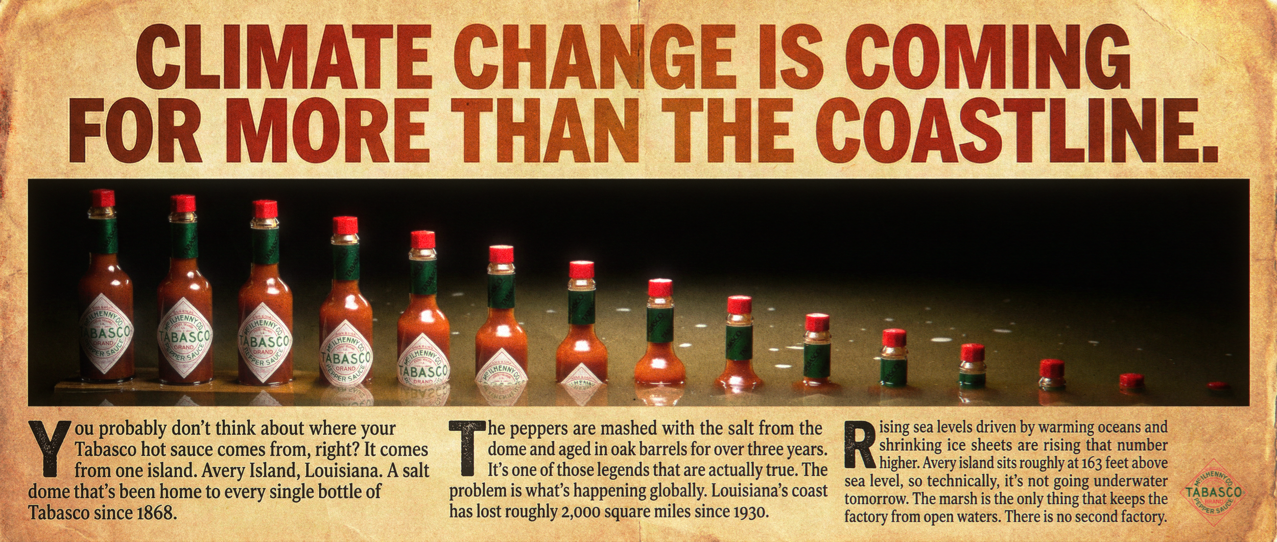
Everything starts with one fact which I was shocked to realize. Every bottle of Tabasco is made from a single place, Avery Island, Louisiana. A salt dome where peppers are grown, mashed with that island salt and aged in oak barrels for three years, since 1868.
What if it wasn’t there?
Louisiana has lost over 2,000 square miles of coastline since the 1930s. The threat isn’t immediate but if climate change accelerates, the timeline shortens.
This campaign takes that concept and dramatizes it, not to predict a disaster, but to make people look at a bottle and think where it actually comes from. The goal isn’t panic, it’s awareness. Plant a seed now, and the next time someone sits down at a diner and reaches for the hot sauce, Tabasco now means something it didn’t before.
Tabasco Bottle Mouse Scroll Experience
This visual I created shows you the aftermath.
As you scroll, floodwater rises from the bottom and the bottle nearly goes underwater. It’s the same idea as the campaign, just interactive. You control the pace, which is kind of the point.
*Keep mouse over image and scroll—afterwards, move mouse off image and keep scrolling
LIMITED-EDITION TABASCO PACKAGING
The water level printed on the label rises across the series: 25%, 50%, 75% and nearly submerged. The Tabasco diamond logo gets swallowed by murky water as the water levels increase. By the last bottle, you can barely read it.
This is all intentional. It’s unlike traditional packaging. It makes you visually stop for a second. You squint a bit. You pick it up potentially and try to read what’s happening here. Something is clearly wrong with it and you want to figure it out. The packaging does exactly what the campaign is doing. Taking something familiar and making you look at it differently.
THREE STYLES
There are three versions of the same idea. Three distinct creative directions which imply different tones, different visual languages and frankly different audiences. Any one of them could run on its own campaign. Together, my thought was they give a creative director options.
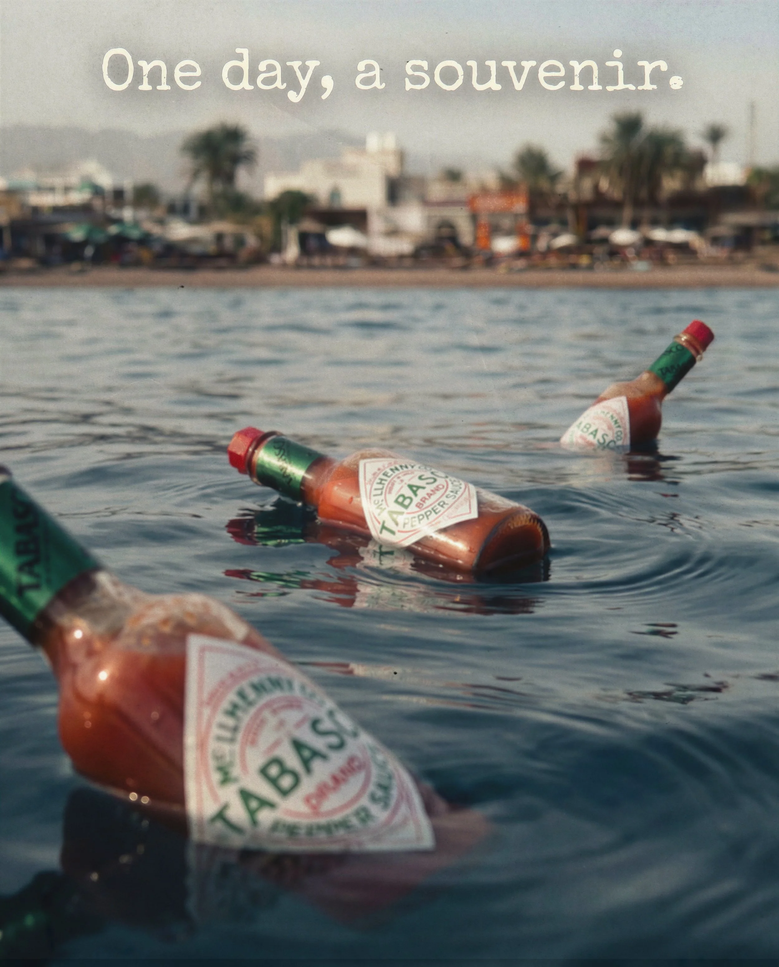
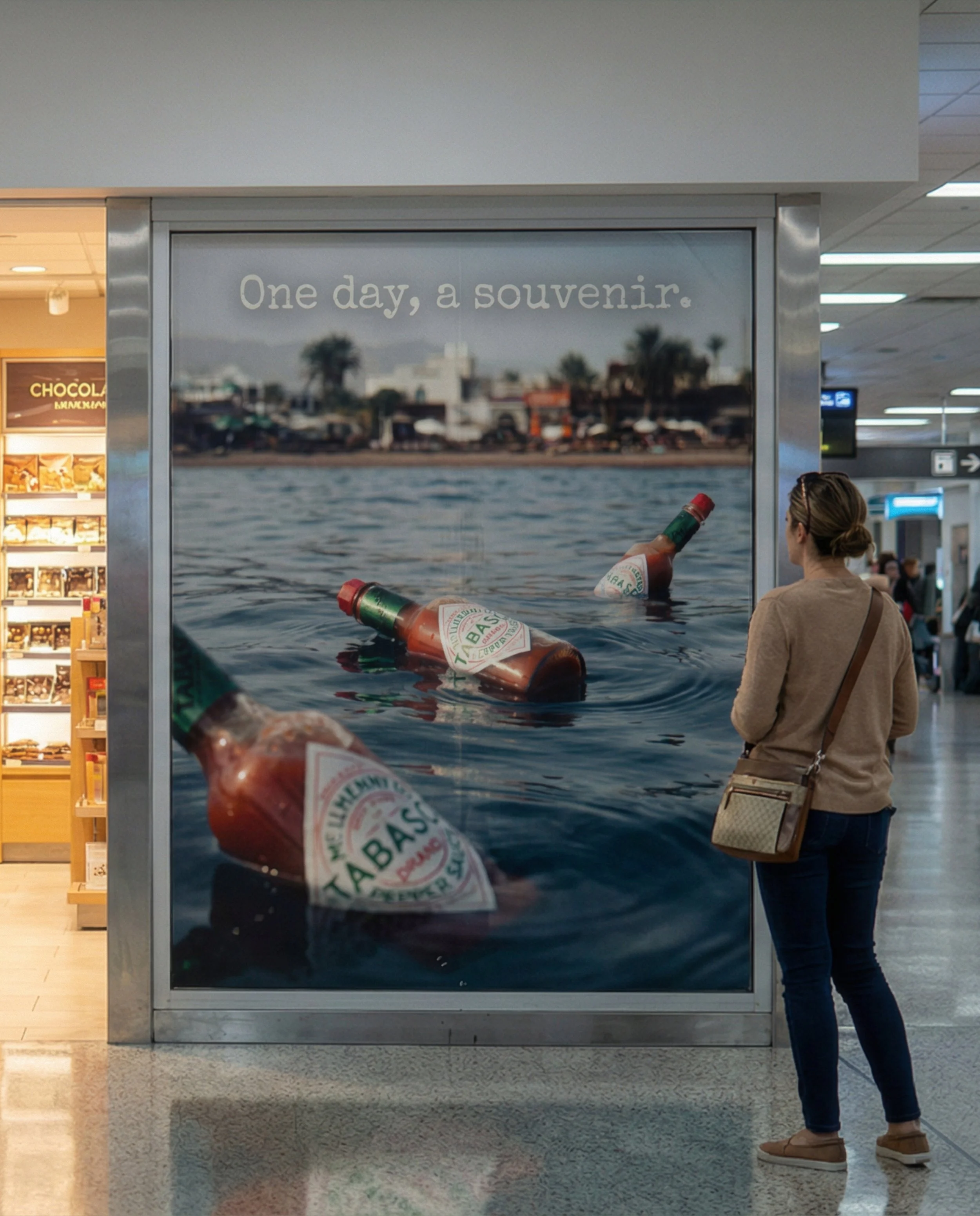
“One day, a souvenir.” is quiet. It’s primarily targeting travelers and tourists. People who buy Tabasco as a gift and take it home.
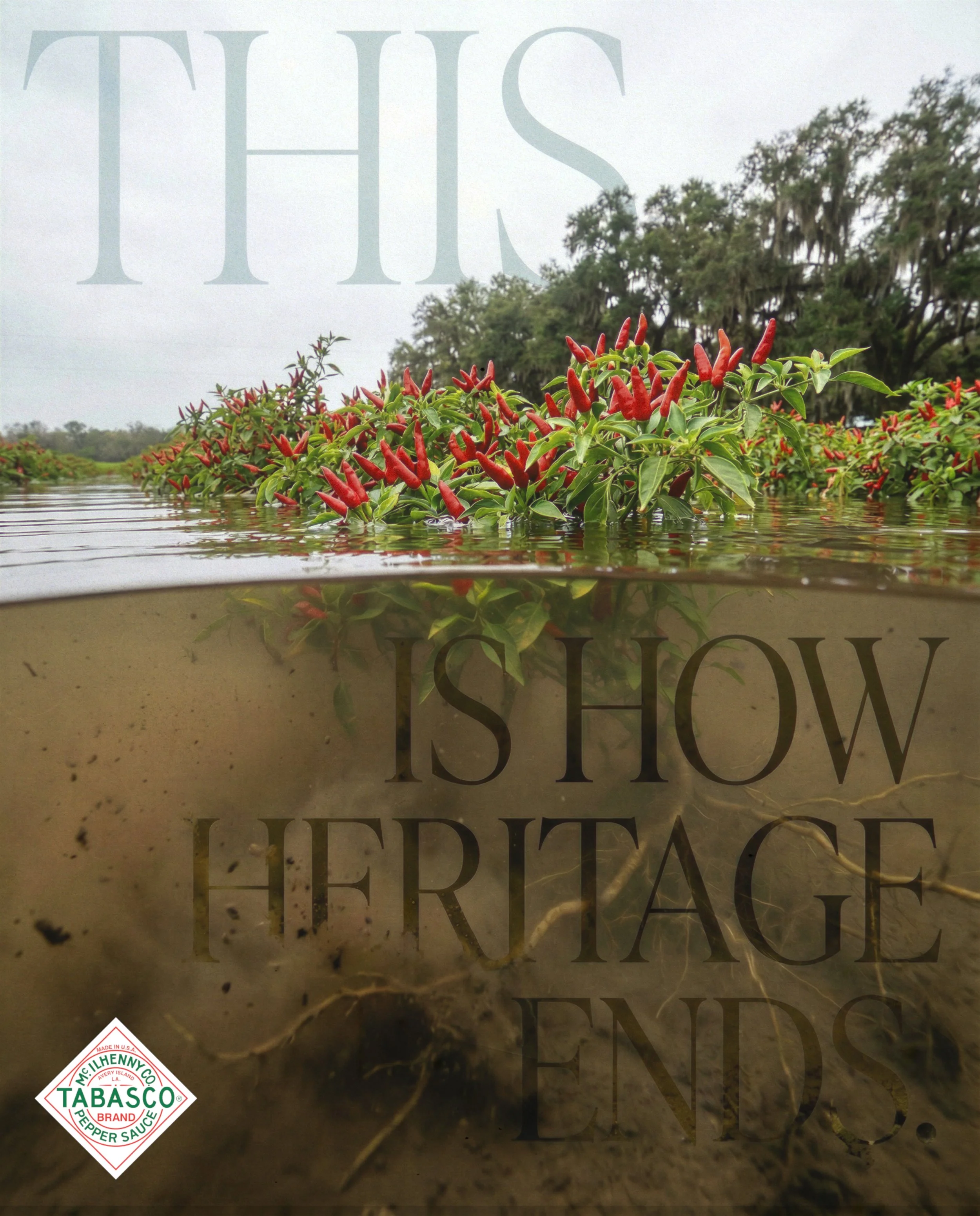
“This Is How Heritage Ends.” is editorial. It’s the one that sits in a magazine or a poster and makes you visually study it.
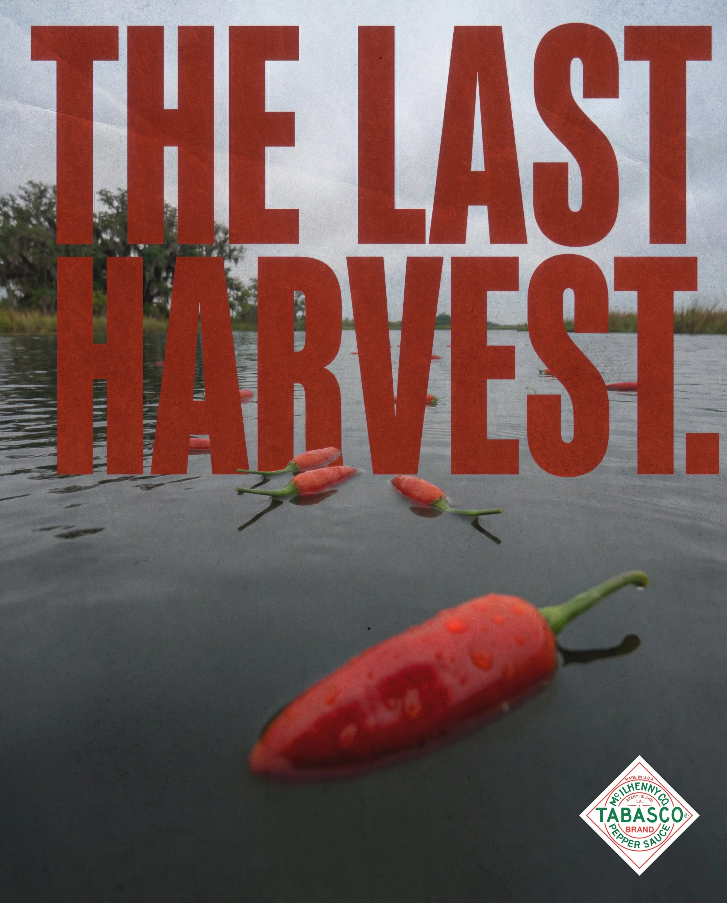
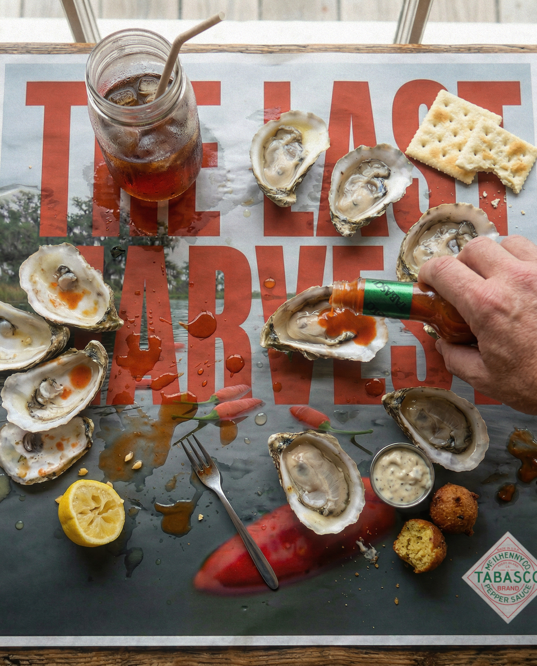
“The Last Harvest.” is bold. Red type, close crop, it’s built for scale.
Spec campaign, not produced by or affiliated with Tabasco.
All done by me.
OOH
The placements are not random. Tabasco isn’t a luxury brand. It’s not a fashion brand. It lives at diners, oyster bars, BBQ joints, breakfast joints, airports. So that is where the ads go.
The airport placement “One day, a souvenir.” Is near a duty-free shelf where tourists can buy Tabasco as a souvenir.
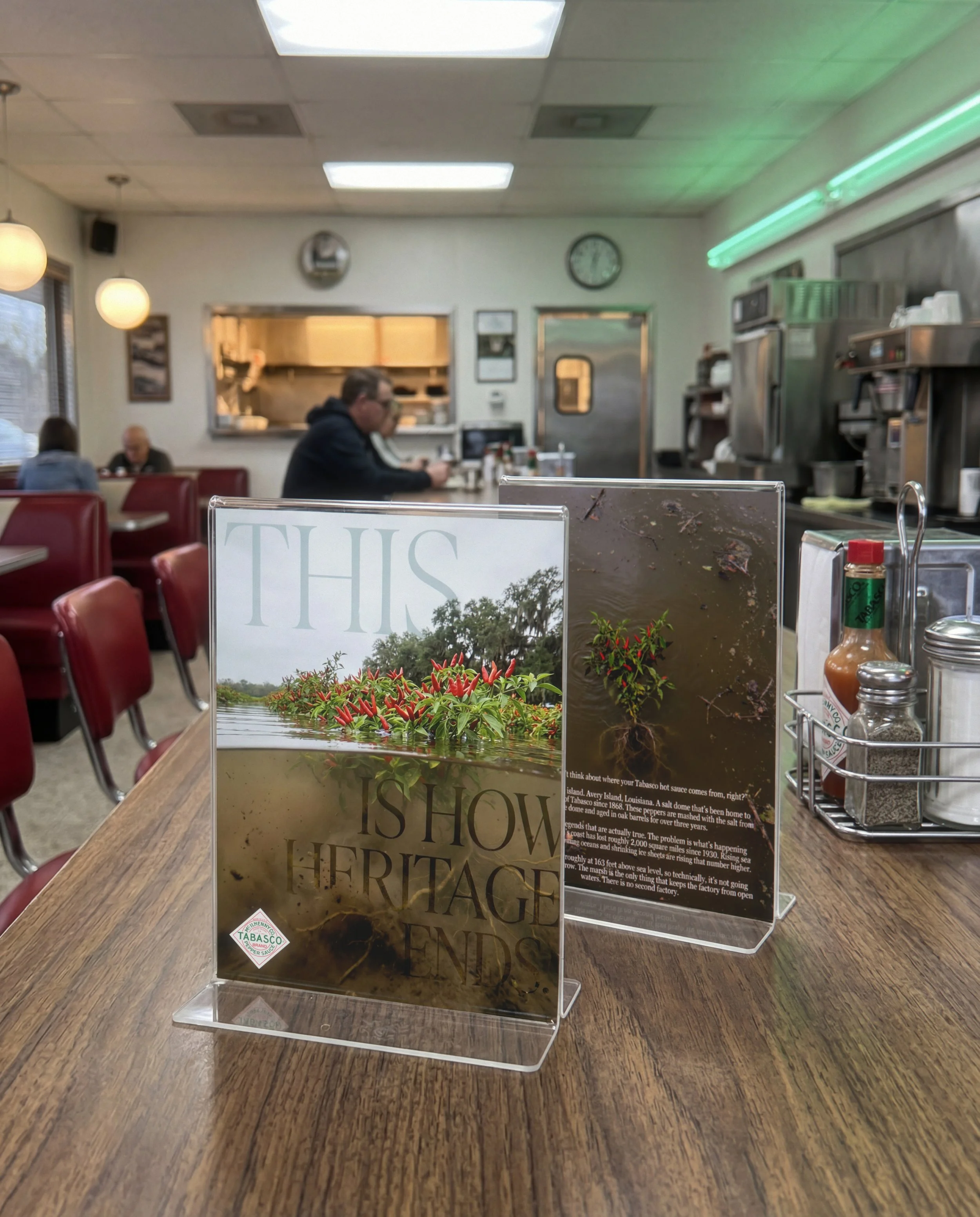
The diner table tent puts “Heritage Ends” next to the Tabasco and informs you of how climate change is affecting Avery Island.
The oyster bar placement puts “The Last Harvest” under your food while you’re eating and let’s hope nobody mistakes it for their last supper.