Band-Aid
Band-Aid KNIGHTS
When your child falls down, give them a protector and not just a bandage
Role: Concept Development, Art Direction, Campaign Strategy, Visual Design, Packaging Design
THE PROBLEM
Every child’s bandage brand uses some sort of intellectual property. Spider-man. Elsa. Paw Patrol. Dora. When the child gets hurt, they ask for the character and not necessarily the bandage. Band-aid has a 30% market share in the U.S. and it’s name is basically a noun, but in the kids’ aisle, it doesn’t matter. The brand hides behind licensed IP it will never own.
THE INSIGHT
When a child falls down, a parents first reaction isn’t to distract them with a cartoon. It’s to make them feel brave. The only tool bandages give parents is a licensed character on it. Feels like a bit of a distraction and not empowerment. No brand in this space talks about what a bandage does in the moment. Focus should be on… IT PROTECTS.
THE IDEA
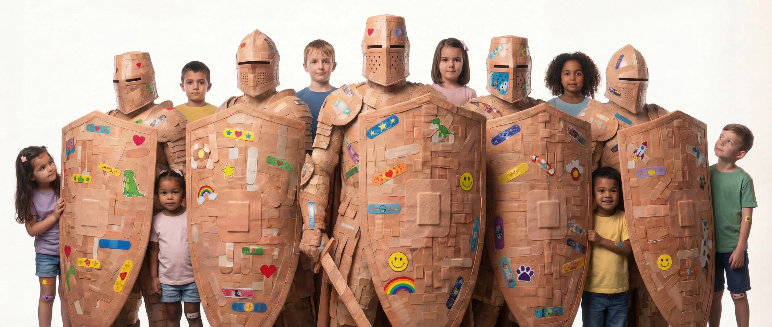
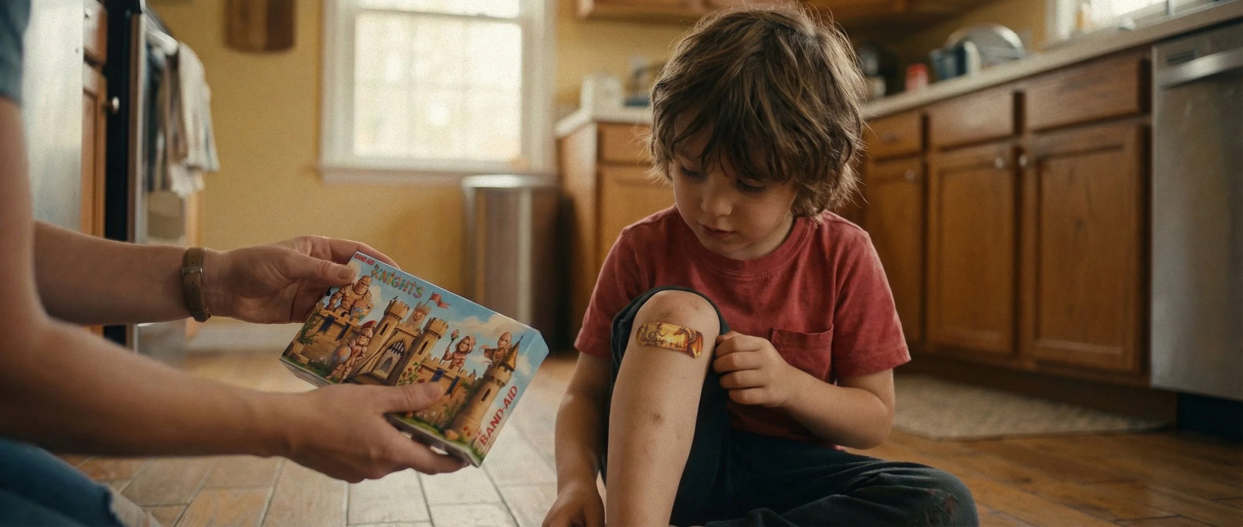
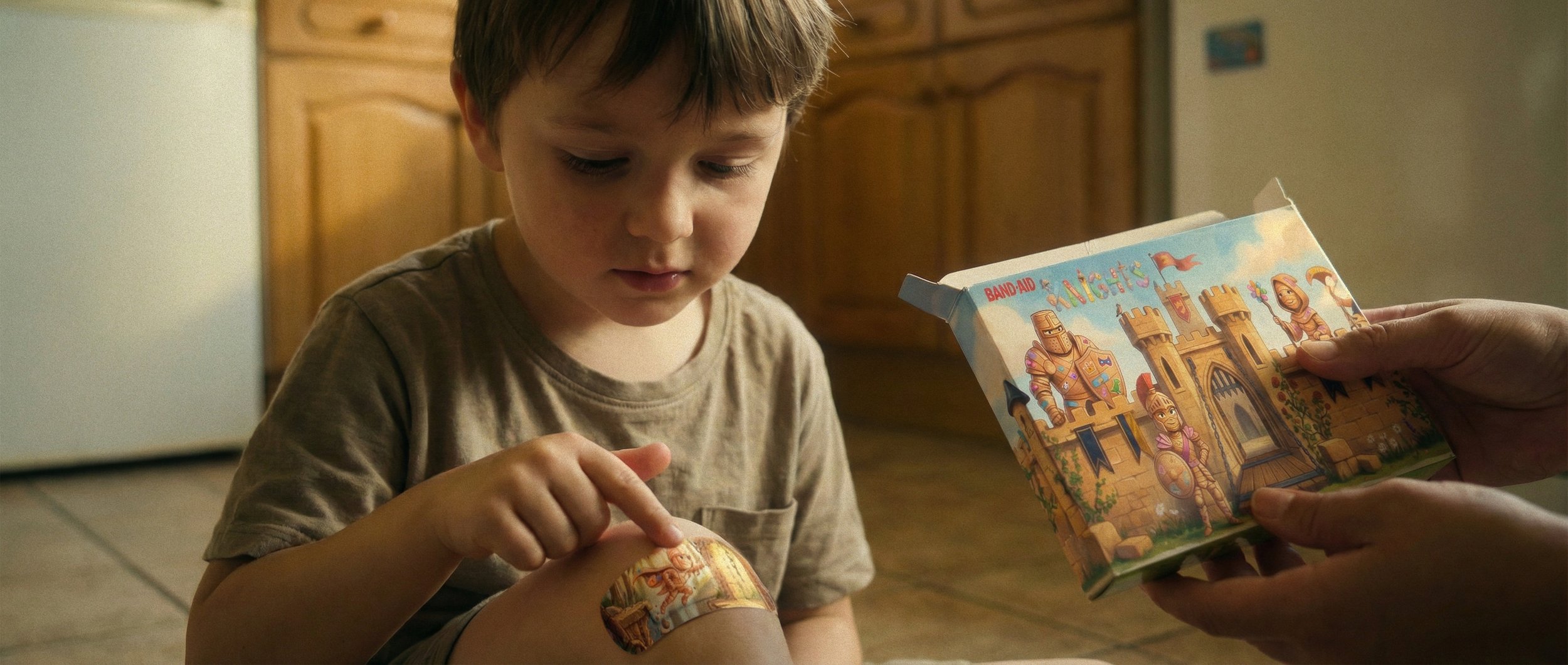
Band-Aid creates its own original characters. Knights built entirely from bandages that the brand owns outright. The knights don’t decorate the bandage. They are the bandages. When a parent places one on a hurt knee, a knight is literally standing guard over the wound.
This isn’t a product extension, it’s a repositioning of how kids experience the entire Band-Aid brand. Transforming each moment of getting a bandage from fixing a boo-boo, to calling a defender.
The name is the tagline. “Band-Aid Knights” is the battle cry. When a kid gets hurt, they don’t ask for a bandage, they call out to their knights. “I need Band-Aid Knights!” (what a child would actually yell, similar to how kids call out to their heroes.) Except now, every time they call for help, they’re saying the brand, Band-Aid.
The name functions three ways, the campaign name, summons in the moment of injury and as a badge of courage. “I have Band-Aid Knights.”
THE MECHANIC
This campaign isn’t just a message, it’s a product system with three main layers:
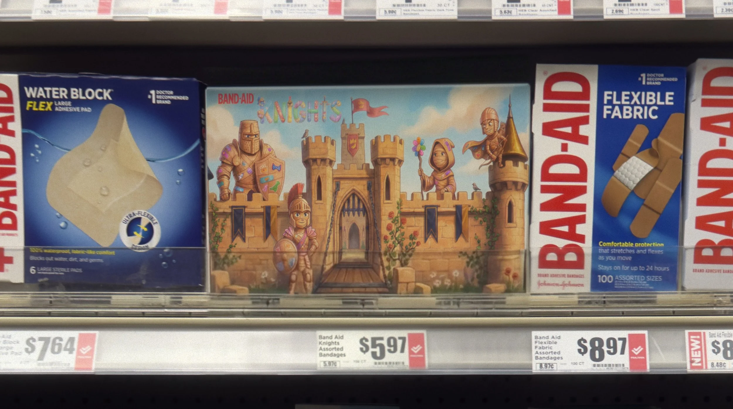
The Castle Box: is the outer packaging, printed as a fully illustrated castle with the knights cast.
The Tin Shields: sits inside the castle box. A stamped metal container shaped like a shield, holding say 50-100 bandages. Each box features a different character on the tin face. Whichever one you get varies by box. The tin outlives the cardboard box and it goes into places like the bathroom cabinet, diaper bag, kitchen drawer. When the bandages run out, Band-Aid sells refillable pouches at a lower price point. The child can collect these character stamped shields.
The Knight Bandages: features illustrated characters in protective stances on the band-aid area. When placed on a wound, the knight is positioned directly over the injury, standing guard, avoiding, protecting, etc... Different bandage sizes get different characters.
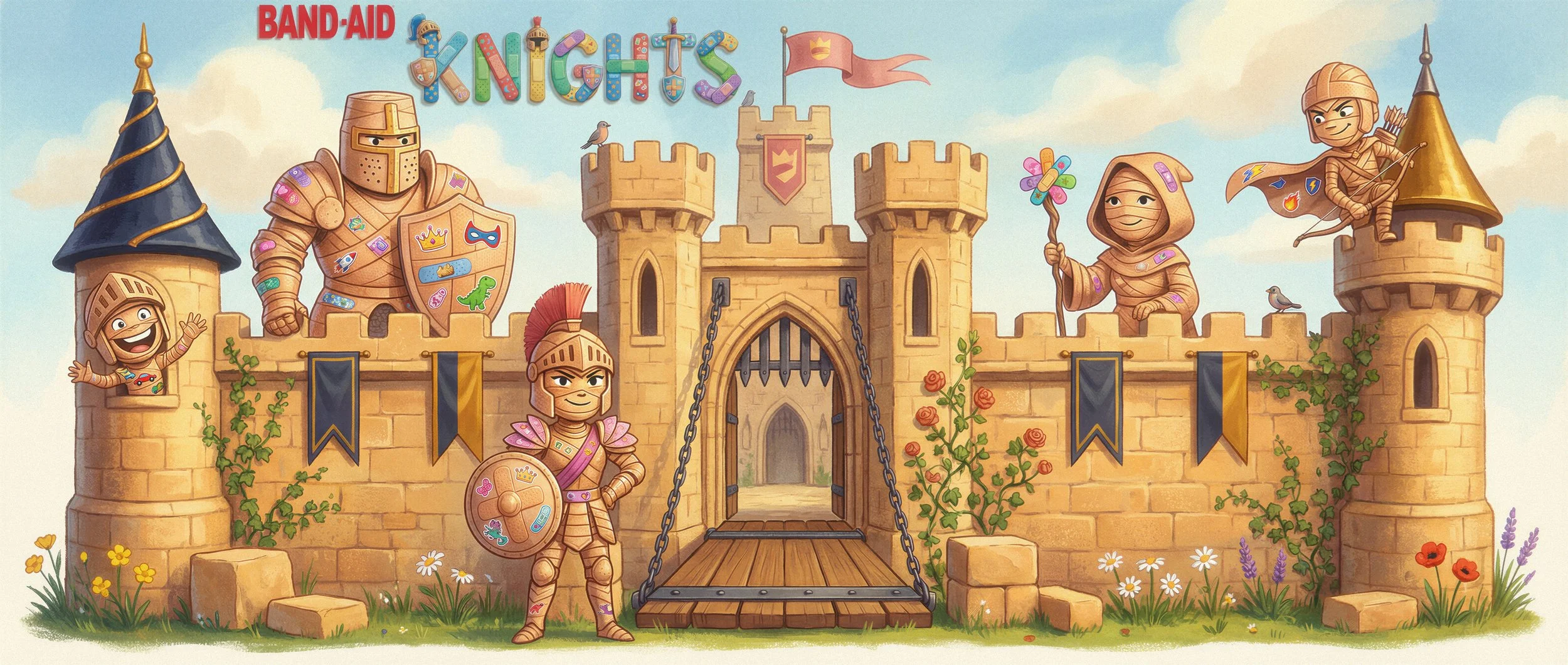
THE CAST
Every character is made up from overlapping Band-Aid strips. The pad is the “chest plate”. The fabric texture of a real bandage is visible in the illustration. They are meant to be made of them.
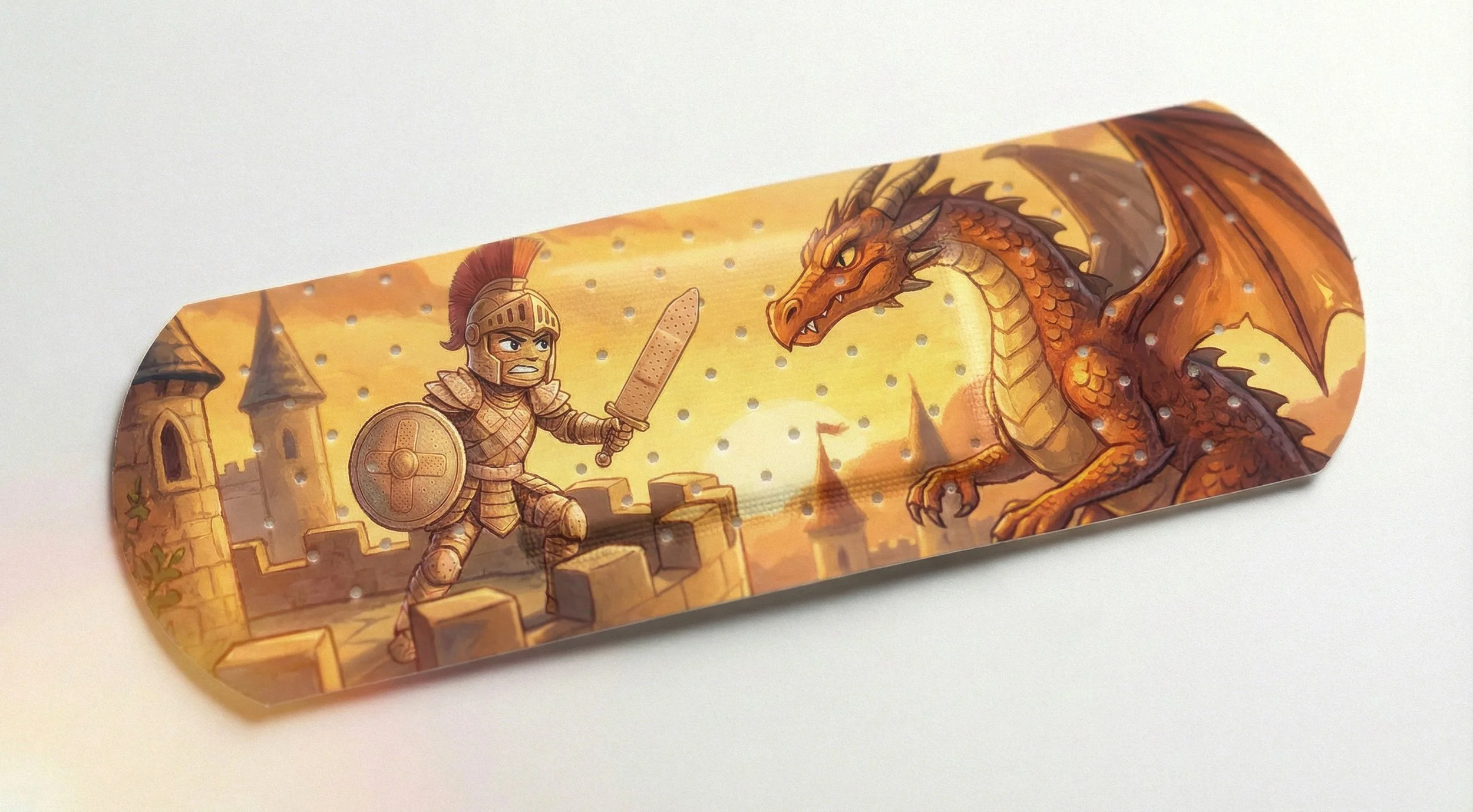

The illustration style is, warm palette, brushwork, gouache-like texture. The characters needed to work at two scales. Detailed enough for the castle box artwork but also recognizable on a Band-Aid.
THE TIN SHIELDS
Each shield features a different character in their environment. The playground knight guards, the swings. The sorceress watches over bedtime. A back-to-school mini-knight greets the kids back to school. The idea is Band-Aid owns the entire cast and can release new shields year-round.
The character tins are an artifact that gives the brand a physical permanence within the home. A kid who’s used Band-Aid Knights for a year has three or four shields in the house. No competing bandage brand has that—an actual object instead of a wrapper in the trash.
THE MOMENT
This campaign doesn’t need to reach kids through advertising. It reaches them through parents. At the moment of injury, where the parent tells the story. “Let’s open the castle and get you a knight.” The bandage goes on. “Your knight is on guard. You’re protected.”
That’s a different emotional exchange than “Here’s your Elsa bandage.” It’s instead empowerment, and not a distraction. And over time, the child doesn’t wait to be told the story. Instead they call for it themselves. “I need Band-Aid Knights!” The brand name becomes the slogan.
AT THE SHELF
On a store wall, identical character-bandage boxes, the Band-Aid Knights stand out. Visually distinct and promises something more than a disposable cartoon print. The castle box is designed so that lined up on a shelf, the details form a continuous skyline.

HOW IT GROWS
Band-Aid will own the entire knights cast. No IP partners to negotiate with.
Halloween gets a spooky Castle box and a skeleton knight. The holidays get a red-and-green shield knight. Each seasonal drop refreshes the style without any lead time, overhead or revenue sharing that licensed character require.
Spec campaign, not produced by or affiliated with Band-Aid.
All done by me.